

Rating and Reviewing in the Libby app as if by magic!
Rating and Reviewing in the Libby app as if by magic!
Rating and Reviewing in the Libby app as if by magic!
Wouldn’t it be enchanting if you didn’t need to exit the Libby app to look for book ratings and reviews prior to diving into a novel or saga?
Wouldn’t it be enchanting if you didn’t need to exit the Libby app to look for book ratings and reviews prior to diving into a novel or saga?
Wouldn’t it be enchanting if you didn’t need to exit the Libby app to look for book ratings and reviews prior to diving into a novel or saga?
Client
Client
Concept Feature for Libby
Concept Feature for Libby
Role
Role
Research, UX/UI Design, User Testing, Prototyping
Research, UX/UI Design, User Testing, Prototyping
Duration
Duration
80 hours
80 hours
Overview
Overview
Overview
The Problem
The Problem
Users of the Libby library app are frustrated because they have to leave the app to see the book's ratings and reviews on a third-party website before deciding to borrow a book or place it on hold.
Users of the Libby library app are frustrated because they have to leave the app to see the book's ratings and reviews on a third-party website before deciding to borrow a book or place it on hold.
The Solution
The Solution
Adding a rating and review feature will save the users from the frustrations of leaving the app to find this information on competing sites and assist them in their decision to borrow a book.
Adding a rating and review feature will save the users from the frustrations of leaving the app to find this information on competing sites and assist them in their decision to borrow a book.


Discovering
Discovering
Discovering
App Store Reviews Observation
App Store Reviews Observation
Skimming through the App Store reviews for the Libby app, it was noted that some users were frustrated because they had to leave the app to find ratings and reviews on other sites. This creates unnecessary steps on their journey to find a new book to read and a missed opportunity for engagement between Libby and its users.
Here is what some users expressed in their reviews:
"I have to [go to] GoodReads for reviews"
"I have to [go to] GoodReads for reviews"
"I have to [go to] GoodReads for reviews"
-FrustratedLibbyUser
-Frustrated LibbyUser
-FrustratedUser
"It'd be nice if you could rate the books"
"It'd be nice if you could rate the books"
"It'd be nice if you could rate the books"
-UnhappyLibbyist
-UnhappyLibbyist
-UnhappyLibbyist
"Please, bring back ratings on books!"
"Please, bring back ratings on books!"
"Please, bring back ratings on books!"
-UnfulfilledPerson
-UnfulfilledPerson
User Interviews
User Interviews
Five active Libby users ages 12-35 were interviewed for this project. The main goal of this research was to understand more about how users interact with the Libby app when they go about choosing books to read based on recommendations, reviews, and ratings.
Five active Libby users ages 12-35 were interviewed for this project. The main goal of this research was to understand more about how users interact with the Libby app when they go about choosing books to read based on recommendations, reviews, and ratings.
User Interviews
"Tell me more about your thought process before you decide which book to read next"
"Tell me more about your thought process before you decide which book to read next"
User Interviews
Participants expressed that several things go through their minds before deciding which book to read next.
They often turn to the Libby app to find the next book in a series, because:
• A family member recommended it.
• It caught their attention while searching for another book.
They also consider:
• The length of the book, whether it's a short or long read.
• The number of books in the series.
• The format: "Is this something I can read, or do I prefer to listen to it as an audiobook?"
Defining
Defining
Defining
Research Findings
Research Findings
The biggest research finding is that ratings are one of the most important features users look at when deciding whether or not to invest their time in a new book.
Among other findings:
• 5 out of 5 participants don't read editorial reviews and publisher notes.
• 3 out of 5 participants are more easily inclined to leave a quick rating rather than writing a whole review.
• 4 out of 5 participants say Libby needs a "Ratings and Reviews" section.
HMWs
HMWs
I determined that a "How Might We" chart could be a useful artifact in this scenario as a method to explore ways to help users through their current pain points and aspirations. Charting scenarios in this way allowed me to create open-ended questions that led to the start of thinking about possible solutions.
I determined that a "How Might We" chart could be a useful artifact in this scenario as a method to explore ways to help users through their current pain points and aspirations. Charting scenarios in this way allowed me to create open-ended questions that led to the start of thinking about possible solutions.

HMWs
HMWs
In the end, I form them into sentences that read coherently:
"We'd like to explore ways to help Libby users who rely on book reviews decide what to read by easily finding a review section on the Libby app because this can save them time from looking at other apps. How might we create a book review section that's easy to find?"
This is when solutions start emerging.
Researching Competitors
Researching Competitors
Competitive research starts by looking at how others are solving this problem.
• What features make Good Reads and other competitors unique?
• How are they handling their Rating and Review systems?
• What can be emulated?
• What can be improved?
Let's take a look at a few examples:
Competitive research starts by looking at how others are solving this problem.
• What features make Good Reads and other competitors unique?
• How are they handling their Rating and Review systems?
• What can be emulated?
• What can be improved?
Let's take a look at a few examples:
Competitive research starts by looking at how others are solving this problem.
• What features make Good Reads and other competitors unique?
• How are they handling their Rating and Review systems?
• What can be emulated?
• What can be improved?
Let's take a look at a few examples:
Researching Competitors
Barnes and Noble
1. Reviews are found by scrolling down the product page.
2. When tapping "See all" the screen turns into a full display of star ratings, showing the amount of users who rate them a specific number of stars. Filtering options are very user-friendly and intuitive.
3. After users tap on a specific review, the whole review is displayed.
4. User profiles are non-existent on the Barnes and Noble App.

Researching Competitors
Good Reads
1. GoodReads does solely reviews, no reading is happening on this app.
A “Want to Read” button is the most apparent interaction on this screen.
2. As users scroll down the page, bars showing the star ratings are displayed with no percentages or total amounts. Fellow users can “Like” and “Comment” on these reviews.
3. After tapping on a profile, a bigger screen pops up with a very prominent "Share" button and a small window to reply with a comment.
4. Tapping on a user’s photo/name takes you to their profile where fellow users can “friend” or “follow” them. A short bio describing themselves is shown. Total amounts for books, followers, and following are displayed. “Currently Reading” and “Recently Read” lists are also important here.
5. Shown here is an example of a user's “Bookshelves”.

Researching Competitors
Amazon (Kindle)
1. This is how users first come to see the reviews under a product listing page on Amazon. Average ratings and totals are displayed here.
2. After tapping on the "Customer Reviews" section, the star ratings are shown by percentages. A translating option is offered for those who speak English.
3. Each review is shown in its totality. In longer reviews, a “see more” link is added. A “helpful” button is under each review aligned with a secondary “sharing” button.
4. Each user has a limited profile that shows recent reviews, totals for followers, and “hearts” which by assumption are for “Helpful” votes that other users have given them.

Priorities
Priorities
Taking into consideration the research findings, it was evident that the solution to be created needed certain aspects more than others. Libby is mostly a library app, and including an extensive community feature isn't in scope. However, what is needed is a way for users to easily write their reviews and quick access to previously written ones.
A MoSCoW prioritization table was used to display the importance of what needed to be developed based on the competitive research. I chose this artifact for its simplicity. When priorities are clearly laid out, it becomes easier to create an action plan. In my opinion, this tool is crucial for design teams as it helps in reaching an agreement before initiating the project development.

Priorities
Priorities
• This feature must be easy to spot, and users must find their way intuitively while intending to leave a review.
• This feature should also have promptings to persuade users to leave ratings and reviews, and provide each review with a helpful button to hint at other users which responses might be most relevant.
• This new feature could also include a reward system to encourage users to leave their reviews, reminders to leave ratings or reviews, and a recent review section on their homepage.
• However, this feature won't have a social aspect to it. No public profile will be displayed.
Taking into consideration the research findings, it was evident that the solution to be created needed certain aspects more than others. Libby is mostly a library app, and including an extensive community feature isn't in scope. However, what is needed is a way for users to easily write their reviews and quick access to previously written ones.
A MoSCoW prioritization table was used to display the importance of what needed to be developed based on the competitive research. I chose this artifact for its simplicity. When priorities are clearly laid out, it becomes easier to create an action plan. In my opinion, this tool is crucial for design teams as it helps in reaching an agreement before initiating the project development.
Develop
Develop
Develop
Sketching Posibilities
Sketching Posibilities
Identifying specific placements for a new feature on a live, existing app that seamlessly blends with its design and established patterns demanded careful attention to detail and exploring Libby's existing mobile screen real estate through sketching.
Identifying specific placements for a new feature on a live, existing app that seamlessly blends with its design and established patterns demanded careful attention to detail and exploring Libby's existing mobile screen real estate through sketching.
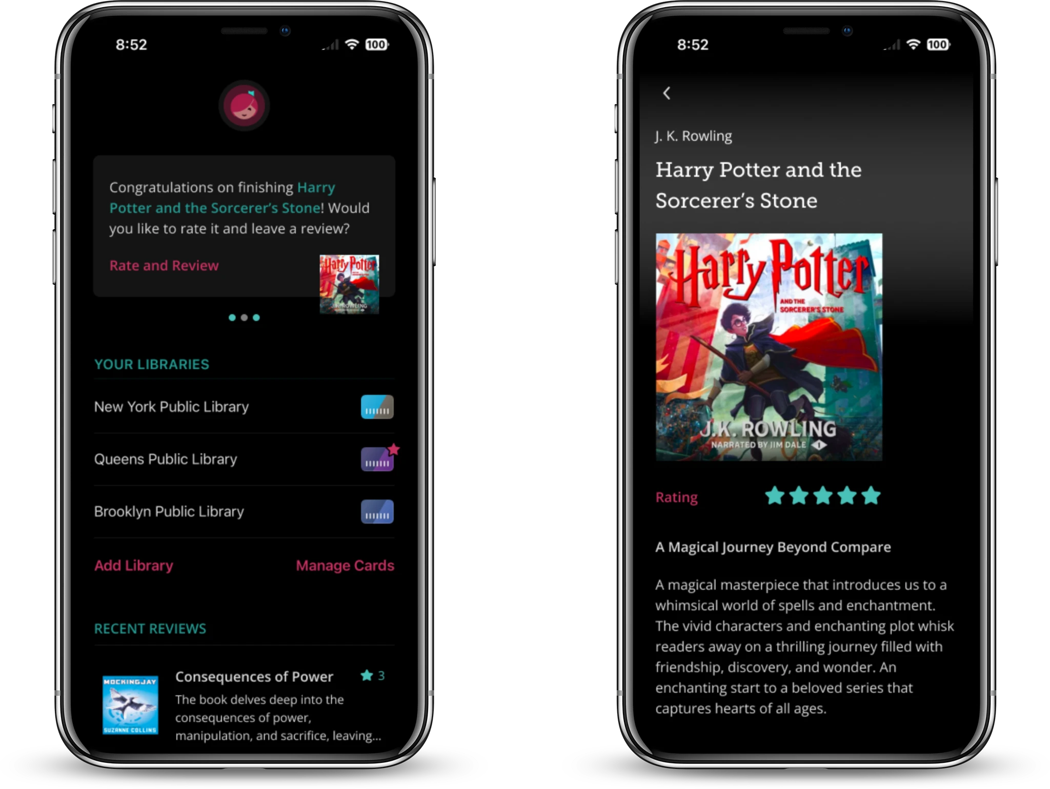
Flow: Finding Book Reviews

In the sketch above, the blue dots outline the user's journey to locate the Book Review Section within the Book Details page. The primary challenge revolved around determining a placement for the star rating that would seamlessly integrate with the existing design.
Flow: Review & Rating Prompt

In this specific flow, the app would prompt users to leave a book review and a rating after finishing their book. The idea is that the users would:
• Read through the options displayed and,
• Choose to leave a review and a rating if they wish to.
Sketching to add a feature to the app rather than sketching a whole screen from scratch, made it significantly easier to focus on specific tasks rather than organizing multiple components on paper.
Translating into High Fidelity

The GIF above loops through the same flow pictured on the previously shown sketch.
In this step, the most challenging part was creating a review section from scratch that required meticulous attention to colors, fonts, sizing, and line height to ensure its seamless integration with the rest of the app.
Sketching Posibilities
In the sketch above, the blue dots outline the user's journey to locate the Book Review Section within the Book Details page. The primary challenge revolved around determining a placement for the star rating that would seamlessly integrate with the existing design.
Sketching Posibilities
Flow: Finding Book Reviews
Translating into High Fidelity
The GIF above loops through the same flow pictured on the previously shown sketch.
In this step, the most challenging part was creating a review section from scratch that required meticulous attention to colors, fonts, sizing, and line height to ensure its seamless integration with the rest of the app.
Translating into High Fidelity
Flow: Finding Book Reviews
Finding Book Reviews Flow
In the sketch above, the blue dots outline the user's journey to locate the Book Review Section within the Book Details page. The primary challenge revolved around determining a placement for the star rating that would seamlessly integrate with the existing design.
Sketching Posibilities
In this specific flow, the app would prompt users to leave a book review and a rating after finishing their book. The idea is that the users would:
• Read through the options displayed and,
• Choose to leave a review and a rating if they wish to.
Sketching to add a feature to the app rather than sketching a whole screen from scratch, made it significantly easier to focus on specific tasks rather than organizing multiple components on paper.
Flow: Review & Rating Prompt
Finding Book Reviews Flow
In this specific flow, the app would prompt users to leave a book review and a rating after finishing their book. The idea is that the users would:
• Read through the options displayed and,
• Choose to leave a review and a rating if they wish to.
Sketching to add a feature to the app rather than sketching a whole screen from scratch, made it significantly easier to focus on specific tasks rather than organizing multiple components on paper.
Translating into High Fidelity
The process of translating early sketches to mid-fidelity was swiftly made as multiple iterations were made to the early, hand-drawn sketches.
Translating into High Fidelity
The GIF above loops through the same flow pictured on the previously shown sketch.
In this step, the most challenging part was creating a review section from scratch that required meticulous attention to colors, fonts, sizing, and line height to ensure its seamless integration with the rest of the app.
Deliver
Deliver
Deliver
User Testing
User Testing
Usability tests were performed with 5 participants on the following flows:
•Finding Book Reviews.
• Review Prompting.
• Profile.
The metrics used to assess the success of the website were:
Usability tests were performed with 5 participants on the following flows:
•Finding Book Reviews.
• Review Prompting.
• Profile.
The metrics used to assess the success of the website were:
Completion
of all tasks
Finding: ✔️ Prompting: ✔️ Profile:✔️
Average
time of completion
Finding: 31.6 secs Prompting: 17.58 secs Profile: 19.55 secs
Completion
Completion
Ease
of all tasks
of all tasks
of navigation (out of 5)
Finding: ✔️
Prompting: ✔️
Profile:✔️
Finding: ✔️
Prompting: ✔️
Profile:✔️
Finding: 5 Prompting: 4.8 Profile: 5
Average
Average
time of completion
time of completion
Finding: 31.6 secs
Prompting: 17.58 secs
Profile: 19.55 secs
Finding: 31.6 secs
Prompting: 17.58 secs
Profile: 19.55 secs
Ease
Ease
of navigation (out of 5)
of navigation (out of 5)
Finding: 5
Prompting: 4.8
Profile: 5
Finding: 5
Prompting: 4.8
Profile: 5
Feedback Mapping
Feedback Mapping
Feedback was gathered from user testing into an experience map. This map is a fantastic mechanism to focus on the user's POV and empathize with their pain points. The experience map along with the metrics results will help figure out prioritization for upcoming iterations.
Feedback was gathered from user testing into an experience map. This map is a fantastic mechanism to focus on the user's POV and empathize with their pain points. The experience map along with the metrics results will help figure out prioritization for upcoming iterations.


Users' Pain Points
Users' Pain Points
Based on user testing feedback and metrics, the most evident pain point was the usability of the prompting section.
The prompt to rate and review a recently finished book was:
• "Too confusing",
• The visual cues didn't look interactive enough and as a result,
• Users took longer than estimated to decipher the flow.
The confusion with this flow correlates with its lower rating among all the flows' "Ease of Navigation" metrics.
Here's a look at the first version of this flow.
Solution
What the participants said
This flow was originally designed very conservatively, trying to cause the least amount of interruption to the existing app's flow. However users were dissatisfied and confused because their task wasn't more inviting.
Iterations
Iterations
Based on the evidence, iterations were made to the original flow to improve the visual cues to guide users to where it's needed:
Based on the evidence, iterations were made to the original flow to improve the visual cues to guide users to where it's needed:
Testing Iterations
After this iteration, it was time to put the design decisions to the test. Would these small changes truly help improve the usability of this flow?
The table above shows an average completion time improvement of 303% compared to the original design. These iterations were favorable, reducing user frustrations and resulting in happier readers for Libby.


Insights from Testing
In this iteration, the button "More" was switched to a more inviting call to action. Now this button displays "Write a Review", in hopes of improving both Libby's engagement and user's satisfaction. Information that used to be under the previous button can also be found in other areas of the app.
Users can now be more easily guided to keep interacting with the app even after they have finished a book.
Other Iterations
Other Iterations
These are small changes that also helped make a difference:
These are small changes that also helped make a difference:


Testing Iterations
After this iteration, it was time to put the design decisions to the test. Would these small changes truly help improve the usability of this flow?
This flow was originally designed very conservatively, trying to cause the least amount of interruption to the existing app's flow. However users were dissatisfied and confused because their task wasn't more inviting.
Testing this Iteration
What the participants said
The table above shows an average completion time improvement of 303% compared to the original design. These iterations were favorable, reducing user frustrations and resulting in happier readers for Libby.
In this iteration, the button "More" was switched to a more inviting call to action. Now this button displays "Write a Review", in hopes of improving both Libby's engagement and user's satisfaction. Information that used to be under the previous button can also be found in other areas of the app.
Users can now be more easily guided to keep interacting with the app even after they have finished a book.
Final Product
Final Product
Final Product


Insights from Testing
Though this is a conceptual design, it's proven that it is feasible for Libby to integrate a "Ratings and Reviews" section on their app. This feature's design blends seamlessly into their existing app and it's easy for users to use.
This feature will prevent users from leaving the app to read reviews on other sites, ensuring they make quicker decisions about what to read next.